- Brand Identity
- Branding
- Web design
Sky & Taylor

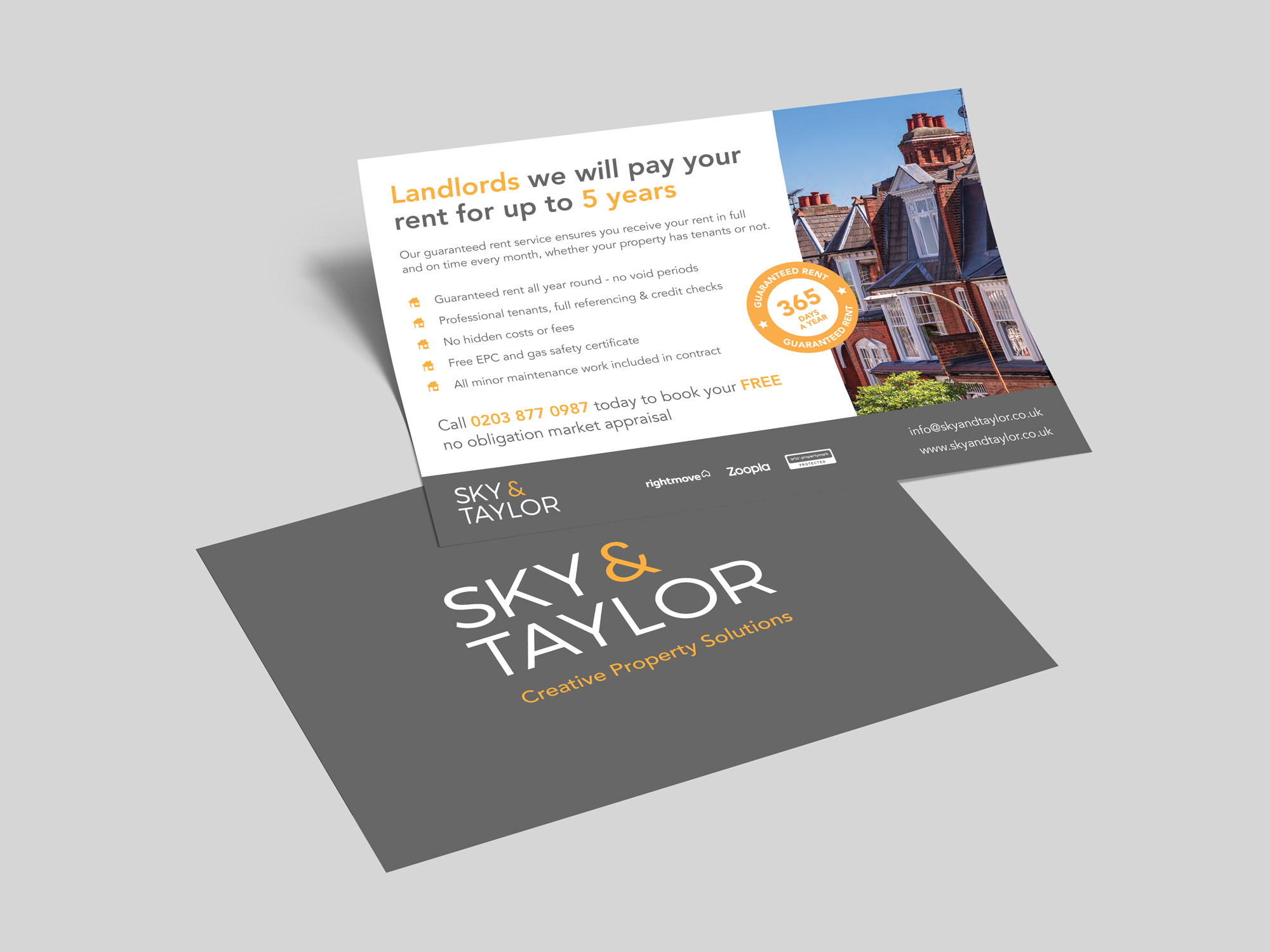
Sky & Taylor are a property management company that provides professional tenants for landlords with the offer of guaranteed rent. Guaranteed rent is a concept that has begun to take off in recent years but there has been a negative stigma attached to it so we needed to ensure that this was the case with Sky & Taylor.
We started by discussing the requirements of the project and what needed to be produced first. We talked about the type of clients that would need the services of Sky & Taylor and began to create a client profile. From here we began exploring typography and potential colours that would appeal to the target audience.
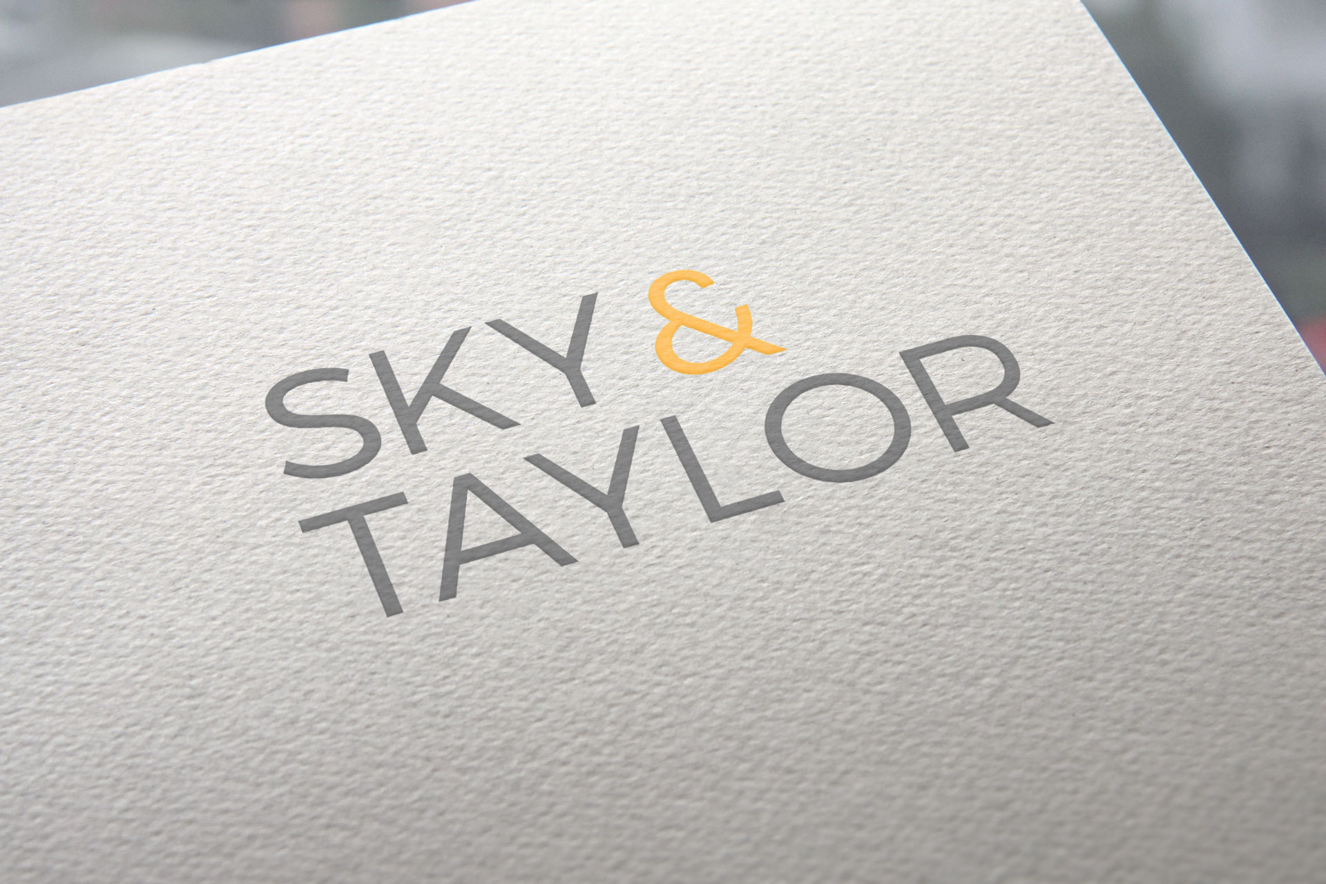
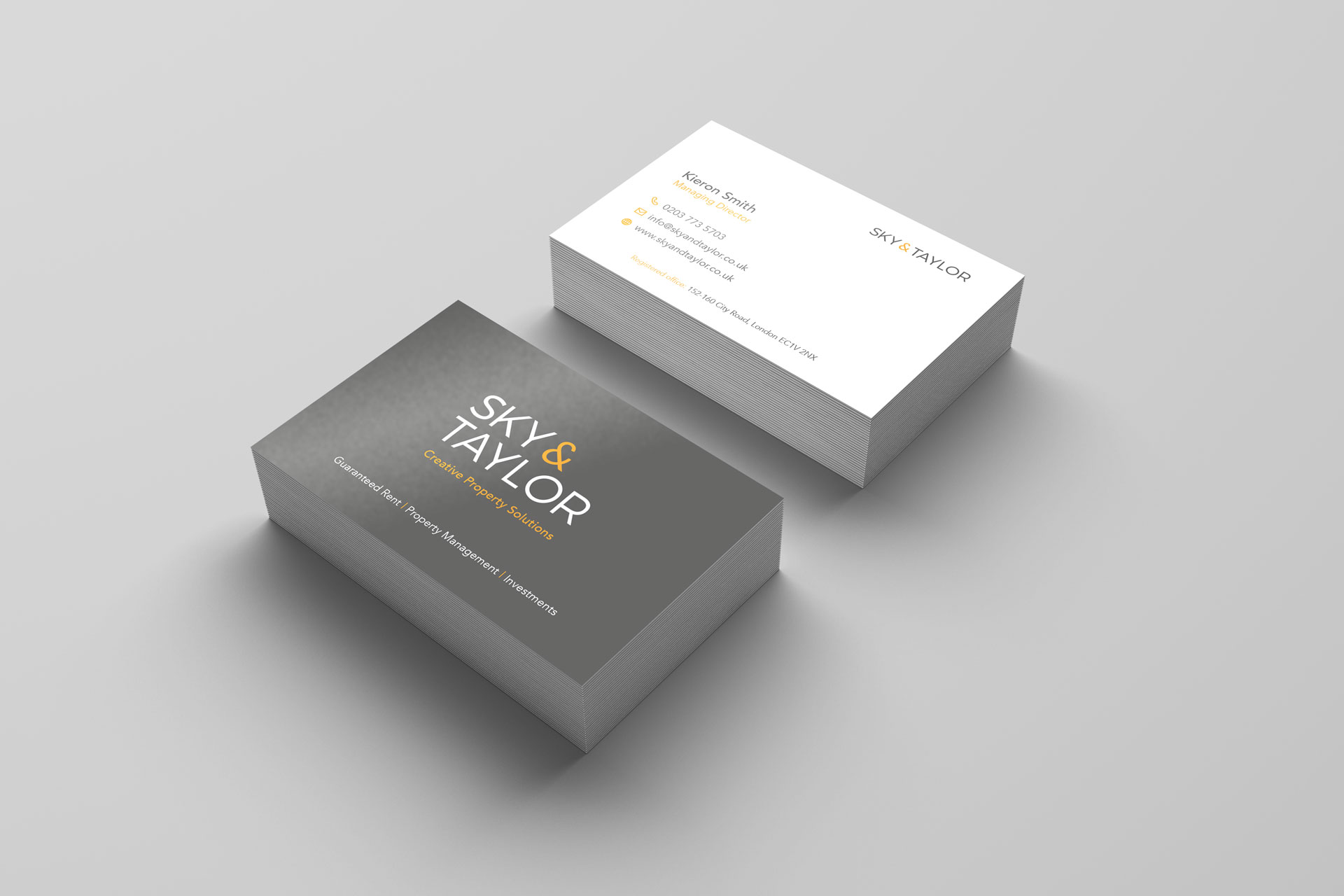
We began with the logo, which we wanted to keep simple and fit in with the property industry. A sans serif typeface was used for a modern and professional feel. The logo was designed in both a linear and stacked format but instead of choosing between the two, it was decided we could use both for different reason. The linear logo is for (mainly)web and stacked for print purposes.
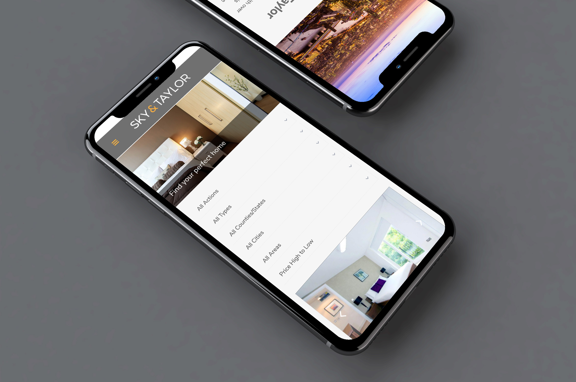
Once the logo was designed, we began work on the website. This was the major part of the project as the remit was to drive potential clients to the website.
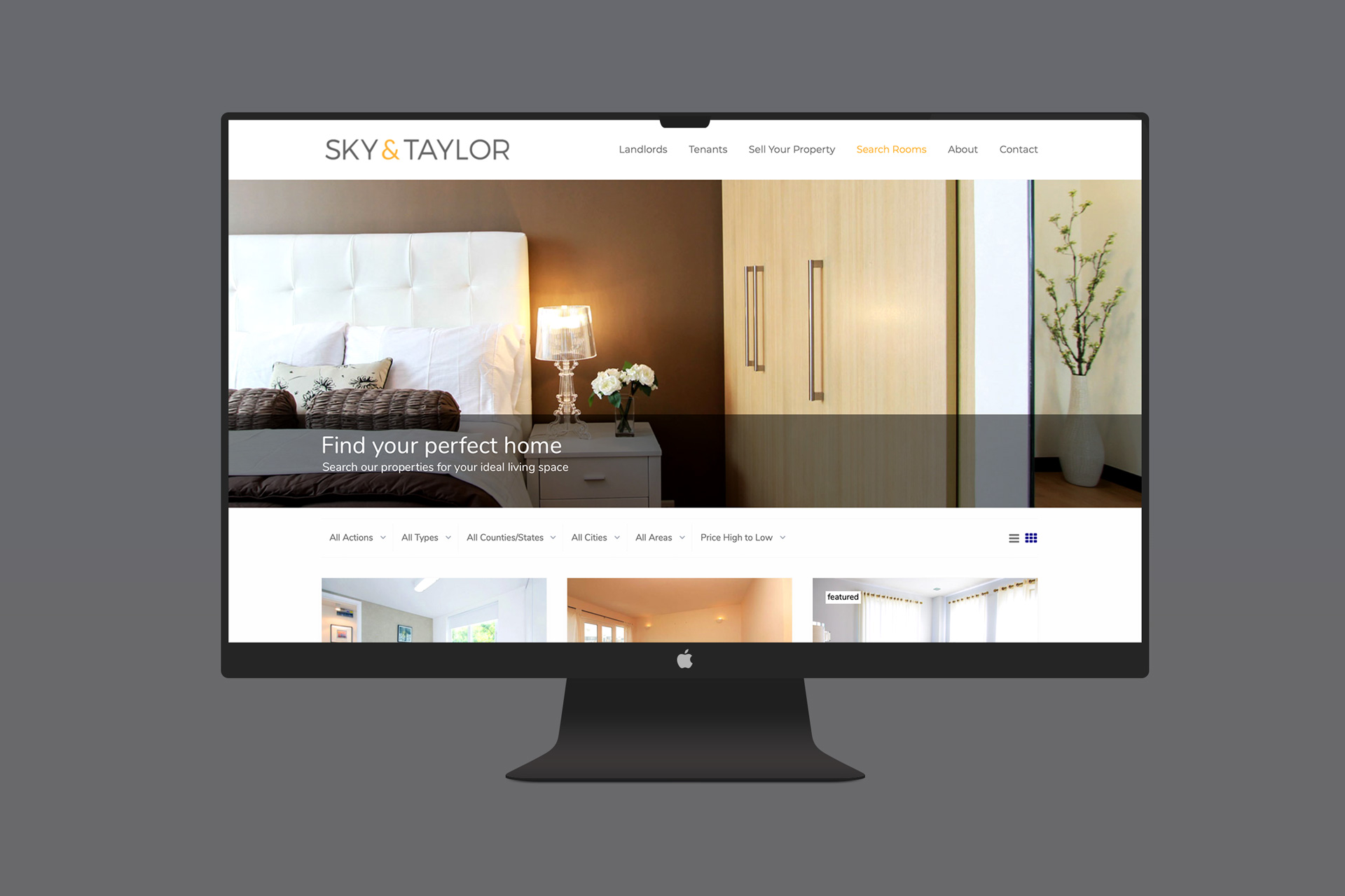
The site contains a lot of information that both landlords and prospective tenants would need to know. Therefore, it was a challenge to ensure the site wasn’t cluttered and users weren’t overwhelmed with the amount of information.
To keep interest and the page flow we divided information into more manageable sections with the us of images, icons, colours and parallax elements, taking the user on a journey that culminates with FAQ’s and a call to action.